

Performance dashboard metrics are the small set of measurable indicators leadership uses to decide what to do next. The single rule that separates a useful dashboard from a decorative one: include only metrics that would change a decision if they moved. Every one of those metrics needs a named owner, a target or benchmark, and a visible "last updated" stamp, or nobody will trust the numbers enough to act on them.
TL;DR:
- Metrics should only be included if their movement would influence decision-making, with clear ownership, target, and last updated information to ensure trust.
- Standardized definitions across departments, including grain, filter, time window, and source, are essential to prevent conflicting interpretations of key metrics like churn.
- Dashboard types and refresh rates must match decision cadence, with strategic dashboards updated weekly or monthly and operational dashboards in real-time for frontline management.
- Effectively turning metrics into action requires long-term trends, clear benchmarks, disaggregation, outcome links, and discussion prompts to stimulate decision-making.
- Validating data quality upstream through reconciliation, automated alerts, lineage documentation, and designated stewards prevents incorrect data from misleading decisions.
Table of Contents
- What Counts as a Performance Dashboard Metric (and Why Definitions Keep Breaking)
- Matching Dashboard Type to Decision Cadence
- Five Design Elements That Turn Metrics Into Action
- Which Metrics Actually Belong on Function-Specific Dashboards
- The Six-Step Checklist for Choosing and Maintaining Metrics
- How Strategy Haus Turns Dashboards Into Execution Tools
- Common Pitfalls in Selecting and Interpreting Performance Metrics
- How to Validate Data Quality Before It Reaches the Dashboard
- Tying Dashboard Metrics Back to Business Strategy
- Bringing Multiple Data Sources Into One Metrics View
- Using Benchmarks Without Chasing the Wrong Comparison
- Building One Dataset Into Dashboards for Different Stakeholders
- Why Most Dashboard Advice Gets the Priority Backward
- Sources
What Counts as a Performance Dashboard Metric (and Why Definitions Keep Breaking)
A metric is anything you can count or calculate: page views, revenue, average handle time. A KPI (key performance indicator) is a metric your organization has agreed matters enough to track against a goal. A target is the number you're trying to hit. Variance is the gap between the two, and it's usually the number people actually look at first. Mixing these terms up is how dashboards quietly stop meaning anything.
The fix is a definition template applied to every metric before it goes anywhere near a screen. At minimum, document four fields:
- Grain — what one row represents (a customer, an order, a session, a day)
- Filter — what's included or excluded (active accounts only, completed orders only, US region only)
- Time window — trailing 30 days, calendar month, rolling quarter
- Source — which system or table the number pulls from
Here's why this matters more than it sounds like it should. Ask three department heads to define "churn" and you'll likely get three different answers. Finance might count logo churn (any customer who canceled). Sales might count revenue churn (dollars lost, ignoring account count). Customer success might exclude accounts that downgraded but didn't fully cancel. Put all three on a dashboard labeled simply "Churn Rate" and you've built a number nobody can defend in a meeting. Standardized metric definitions covering grain, filter, time window, and source reduce that kind of argument and make the dashboard credible across departments instead of a source of quiet distrust.
Matching Dashboard Type to Decision Cadence
Not every dashboard should update at the same speed or carry the same number of metrics. The mistake most teams make is building one dashboard type and stretching it to serve every audience.
Four types cover almost every real use case:
- Strategic dashboards — for executives and boards, reviewed monthly or quarterly, focused on outcomes tied to company goals
- Analytical dashboards — for analysts and specialists, used for deep exploration and root-cause work, not daily monitoring
- Operational dashboards — for frontline managers, often refreshed daily or in real time, tracking throughput and exceptions
- Tactical dashboards — for mid-level teams making weekly calls on campaigns, pipeline, or staffing
Executive dashboards should hold a compact set of KPIs, generally 5 to 7 core metrics, updated daily or weekly. Operational dashboards run the opposite direction: they can reasonably carry 15 to 30 or more metrics because a floor manager needs granular, real-time detail to catch problems as they happen.
The governing rule: match refresh cadence to decision cadence. If leadership only meets monthly to review strategy, a real-time feed doesn't make better decisions. It just adds noise and invites people to react to fluctuations that mean nothing over a 30-day window.
Five Design Elements That Turn Metrics Into Action
A number on a screen doesn't change behavior by itself. Research on public-sector dashboards identified five design elements that consistently push dashboards from passive reporting into actual service improvement, and the same logic holds in a corporate boardroom.
- A long time horizon. A single data point tells you nothing. Twelve to twenty-four months of trend lets you separate a real shift from normal noise.
- A visible benchmark or target. Every metric needs something to be measured against, whether that's last year's performance, an industry standard, or an internal goal.
- Disaggregation. Break the top-line number down by region, product line, or team. Averages hide the one segment that's actually in trouble.
- A clear link to outcomes. State plainly why this metric matters to the business, not just that it's being tracked.
- Built-in discussion questions. Prompts like "What changed this month?" or "Which region needs attention?" turn a chart into a conversation starter.
Pro Tip: Default to a trailing 12-month view for anything reviewed monthly or less often. Shorter windows exaggerate seasonal noise and tempt leaders into reacting to blips instead of trends.
In practice, this means your weekly leadership meeting shouldn't open with "here are the numbers." It should open with the disaggregated view and the discussion question already on screen, so the first five minutes go straight to "why did the enterprise segment drop and what are we doing about it," not a recap of what everyone already saw in their inbox.
Which Metrics Actually Belong on Function-Specific Dashboards
The right metric depends entirely on which decision it's meant to inform. A few high-value picks by function, with the decision each one supports:
- Finance: Gross margin percentage (informs pricing and cost decisions, monthly cadence, owned by the finance lead, target set against prior-year baseline)
- Sales: Pipeline coverage ratio (informs whether the team will hit quota, weekly cadence, owned by sales ops, target typically 3x to 4x of quota)
- Marketing: Customer acquisition cost by channel (informs budget reallocation, monthly cadence, owned by demand generation, target benchmarked against customer lifetime value)
- Customer success: Net revenue retention (informs whether the base is expanding or eroding, monthly cadence, owned by CS leadership, target above 100 percent for a healthy book)
- HR: Voluntary turnover rate by department (informs where retention intervention is needed, quarterly cadence, owned by HR business partners, target benchmarked against industry norms)
- Operations: On-time delivery rate (informs whether capacity or process changes are needed, weekly or daily cadence, owned by operations management, target usually above 95 percent)
Each of these earns its spot because a bad number triggers a specific, known response. If gross margin drops two points, finance already knows to check input costs and pricing before the meeting even starts. That's the test for whether a metric belongs on the dashboard at all: does someone know what they'd do differently if this number moved?
The Six-Step Checklist for Choosing and Maintaining Metrics
Most dashboard failures trace back to a handful of avoidable gaps. Run every candidate metric through this sequence before it goes live:
- Confirm it's actionable. If no decision changes based on this number, cut it.
- Assign a single owner. One person, not a team, accountable for accuracy and updates.
- Write the standardized definition. Grain, filter, time window, source, documented and shared.
- Set a target or benchmark. No metric ships without something to compare it against.
- Fix the refresh cadence. Match it to how often the audience actually makes decisions.
- Set a retirement trigger. Decide in advance what would make this metric obsolete, so it doesn't linger for years after it stops mattering.
On the data side, pull metrics from a single warehouse or semantic layer rather than letting each team run its own federated query against source systems. Federated queries are how two departments end up with two different numbers for "active customers" despite pulling from the same underlying database.
Dashboards commonly fail not because the data is wrong, but because metrics lack ownership, timestamps, or targets — the contextual details that let a viewer trust the number enough to act on it.
How Strategy Haus Turns Dashboards Into Execution Tools
A dashboard is only as good as the operating rhythm built around it. Strategy Haus works from the premise that measurement without execution infrastructure just produces well-organized confusion, so the framework starts by translating strategic questions into a small, decision-ready KPI set before anyone touches a visualization tool.
A typical worked example: a leadership team walks in with three strategic questions. Are we growing efficiently? Is delivery keeping pace with sales? Is the team stretched past capacity? Those three questions convert into five to seven KPIs, such as customer acquisition cost, gross margin, on-time delivery rate, pipeline coverage, and utilization rate, each assigned an owner and a target. The weekly ritual that follows matters as much as the metrics themselves:
- A 20-minute Monday review of the dashboard, not a 90-minute status meeting
- One discussion question attached to each metric that moved outside its target range
- A documented decision or action item before the meeting ends, not just a note that something looks off
Strategy Haus emphasizes execution and support throughout the process, which is the piece most measurement frameworks skip. Clients get improved clarity and coordination because the dashboard is built to feed a decision cadence that already exists, not to sit in a folder nobody opens.
Common Pitfalls in Selecting and Interpreting Performance Metrics
The most common mistake is vanity metric creep: adding numbers because they're easy to pull, not because they inform a decision. Total page views, gross signups, and raw social followers all fall into this trap. They look good in a slide but rarely change what anyone does on Monday morning.
A second pitfall is confusing correlation with causation when interpreting a metric's movement. A spike in support tickets might mean product quality is slipping, or it might mean marketing just launched a campaign that brought in a wave of new users unfamiliar with the product. Without disaggregation, both stories look identical on the chart.
Averaging across segments hides the real problem more often than it reveals one. A national on-time delivery rate of 92 percent might mask a regional warehouse running at 70 percent while the rest of the network carries the average.
Metric proliferation is the quieter failure mode. Once a dashboard exceeds roughly a dozen metrics, viewers stop scanning it closely and start skimming for anything that looks alarming, which defeats the five-second scannability standard that makes executive dashboards useful in the first place. Every metric added past that point should replace one, not sit alongside it.
How to Validate Data Quality Before It Reaches the Dashboard
Bad data on a dashboard is worse than no dashboard at all, because it produces confident decisions built on wrong numbers. Validation needs to happen upstream, not when someone finally notices a chart that looks off.
Start with reconciliation checks: compare dashboard totals against the source system on a regular schedule, weekly for high-stakes metrics, monthly for slower-moving ones. A five-minute spot check catches a broken pipeline long before it shows up in a board meeting.
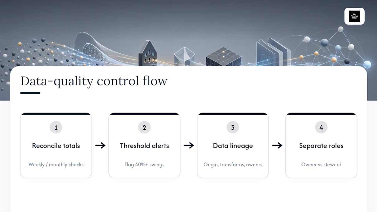
Set automated threshold alerts for implausible swings. A 40 percent overnight jump in revenue is far more likely to be a broken join in a query than an actual business event, and an alert that flags anomalies before publication saves the embarrassment of presenting a number nobody can explain.
Document data lineage for every metric on the dashboard: which system it originates in, what transformations it passes through, and who touches it along the way. When a number looks wrong, lineage documentation turns a debugging session from hours into minutes.
Finally, assign a data steward separate from the metric owner for any dashboard feeding executive decisions. The metric owner is accountable for what the number means and what to do about it; the steward is accountable for whether the pipeline delivering that number is actually sound. Splitting those roles catches errors that a single overloaded owner tends to miss.
Tying Dashboard Metrics Back to Business Strategy
A dashboard disconnected from strategy just becomes an expensive way to watch numbers move. The alignment work starts before a single chart is built.
Begin with the organization's two or three top strategic priorities for the year, stated in plain language. Growth efficiency. Market expansion. Operational resilience. Every candidate metric then has to trace back to one of those priorities through a clear, one-sentence line of logic. If a metric can't complete that sentence, it doesn't belong on a strategic dashboard, whatever team is attached to it.
Cascade the same logic downward. A company-level strategic priority of "improve growth efficiency" should show up on the sales dashboard as customer acquisition cost and on the finance dashboard as gross margin trend, not as some unrelated departmental vanity number that happened to be easy to report.
Revisit the alignment at least twice a year. Strategy shifts, and metrics that made sense during a growth push can become irrelevant once the priority moves to profitability. A dashboard that never gets pruned accumulates leftover metrics from three strategy cycles ago, and those stale carryovers are exactly what erodes trust in the whole system.
Bringing Multiple Data Sources Into One Metrics View
Most organizations run their numbers through a scattered mix of a CRM, an ERP, a marketing platform, and half a dozen spreadsheets nobody wants to admit still matter. Turning that mix into one coherent dashboard is more of a governance problem than a technical one.
The most durable approach centralizes data into a single warehouse or semantic layer before it ever reaches a visualization tool, rather than pulling live queries from each source system independently. That single layer becomes the one place where "customer," "order," and "revenue" get one agreed definition, which is what keeps sales and finance from arguing over whose number is correct.
Where a full warehouse buildout isn't realistic yet, at minimum standardize the join keys across systems. Customer ID, order ID, and date fields need to match precisely across the CRM, the billing platform, and the support system, or every attempt to combine them will silently drop or duplicate records.
Assign a single integration owner responsible for monitoring pipeline health across all sources feeding the dashboard. When one source goes down or changes its schema, that person catches it before a metric quietly goes stale and nobody notices until someone asks why the numbers haven't moved in three weeks.
Using Benchmarks Without Chasing the Wrong Comparison
A target only means something in context, and that context usually comes from a benchmark: last year's own performance, an industry standard, or a direct competitor's public numbers where they exist.
Internal benchmarking, comparing this quarter against the trailing four quarters, is the safest starting point because it controls for your own business model and seasonality. External industry benchmarks add useful perspective but come with a caveat: a benchmark pulled from a company at a different size, market, or growth stage can send you chasing a target that doesn't fit your situation. A 95 percent on-time delivery benchmark from a mature logistics network means something very different for a company still building out its distribution footprint.
Competitor benchmarking works best for metrics with genuinely public data, like pricing, published growth rates, or customer review volume. For internal operating metrics like margin structure or churn, competitor numbers are rarely available with any real accuracy, and building a target around a guessed figure does more harm than skipping the comparison entirely.
The practical move: pair every external benchmark with an internal trend line on the same chart. That combination shows whether you're closing a gap against the market or losing ground, which is a far more useful signal than either number alone.
Building One Dataset Into Dashboards for Different Stakeholders
The same underlying metrics often need to look completely different depending on who's viewing them, and trying to serve every audience from one screen is how dashboards become cluttered and useless for everyone.
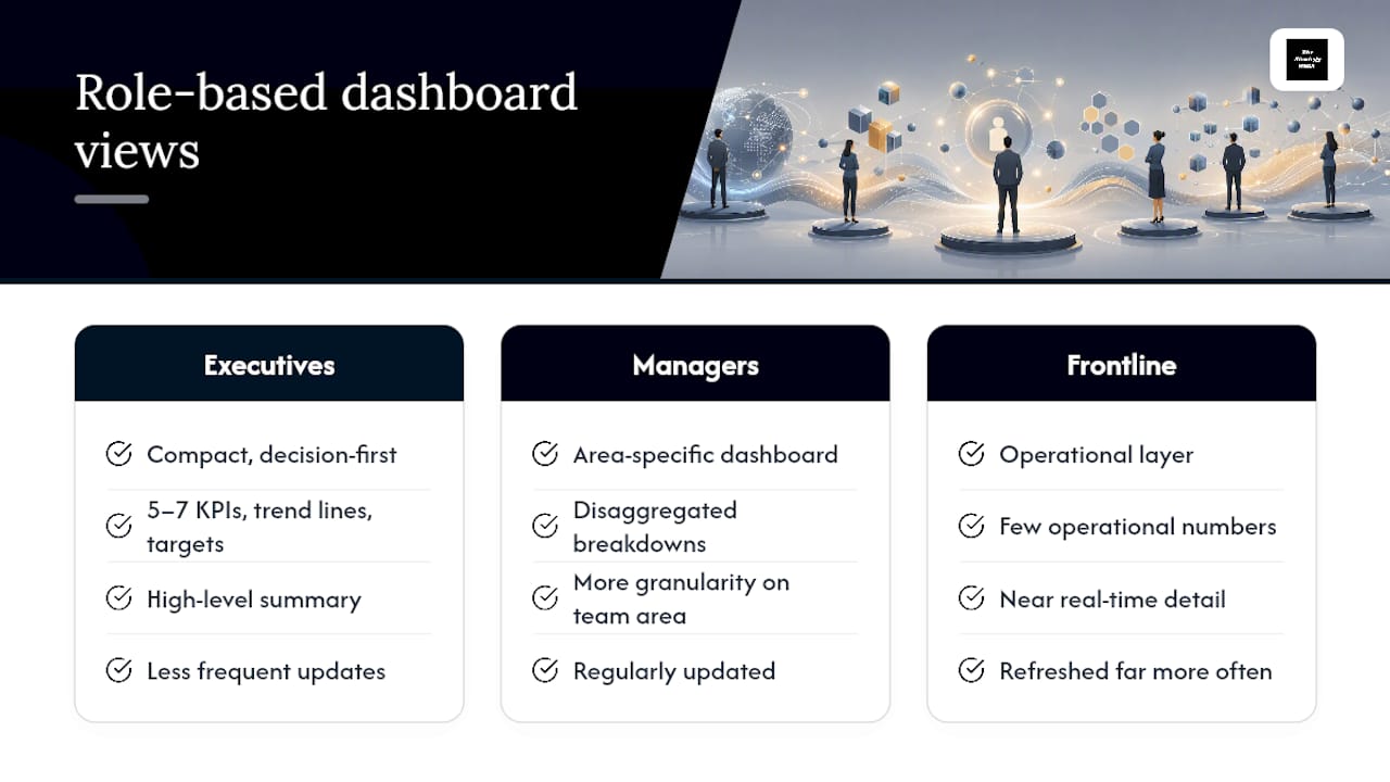
Executives need the compact, decision-first view: five to seven KPIs, trend lines, and targets, scannable in under a minute. Department managers need more granularity on their specific area, along with the disaggregated breakdowns an executive dashboard deliberately leaves out. Frontline teams need the operational layer: near real-time detail on the handful of numbers that affect their daily work, refreshed far more often than anything an executive needs to see.
The efficient way to build this isn't three separate dashboards built from scratch. It's one governed metric layer with role-based views layered on top, so the underlying definition of "revenue" or "churn" never diverges between the executive summary and the operational detail screen. A wedding planning business built exactly this kind of layered view, tracking capacity and delivery metrics operationally while rolling the same data into a simpler summary for client-facing reporting.
Permission and access design matters here too. A department manager shouldn't need to dig through a dozen irrelevant company-wide metrics to find the three that matter to their team, and an executive shouldn't have to filter out operational noise to see the number that actually informs a strategic call.
Why Most Dashboard Advice Gets the Priority Backward
Most guidance on this topic starts with visualization: chart types, color schemes, layout grids. That's backward. The research consistently points the other direction. The five elements that actually move outcomes, benchmarks, disaggregation, discussion prompts, have almost nothing to do with what the chart looks like and everything to do with what happens in the room after someone looks at it.
The conventional advice also overrates metric count as a design problem. Teams argue endlessly about whether the executive dashboard should have six metrics or nine, when the real failure mode is metrics with no owner and no expiration date. A stale metric nobody's accountable for does more damage sitting quietly on a dashboard than an extra row ever would.
If you take one thing from this: build the weekly ritual before you build the dashboard. Decide who reviews which number, on what cadence, and what decision it's supposed to trigger. The visualization tool comes last, not first. Get the governance right and almost any tool will work. Get it wrong and the best-designed dashboard in the world just becomes another tab nobody opens.
— Ashanti
Sources
A few sources back the framework in this article and reward a closer read: