

An effective executive dashboard is a single, one-screen view of a moderate number of metrics leaders need to make fast, accountable decisions. Nothing more. If your dashboard needs scrolling, tabs, or a training session, it isn't executive dashboard design. It's a report wearing a dashboard's clothes.
Before you build or rebuild one, check it against this list:
- One screen, no scrolling required
- a moderate number of KPIs well below thirty
- The north-star metric sits top-left, first thing anyone sees
- Every metric has a status indicator (on track, at risk, off track)
- Drill-down links exist for anyone who wants the "why" behind the number
- A visible "last updated" timestamp on every view
Pull up your current dashboard right now and score it against those six items. If it fails on three or more, the rest of this guide shows you exactly how to fix it.
Key Takeaways
An executive dashboard succeeds when it limits itself to 6 to 12 decision-linked metrics on a single screen with clear ownership and visible data freshness.
| Point | Details |
|---|---|
| Cap the KPI count | Keep the executive view to 6 to 12 metrics tied directly to real decisions. |
| Put the north star top-left | Place your single most important metric where eyes land first. |
| Use progressive disclosure | Hide detail behind drill-downs instead of adding more charts to the summary. |
| Assign an owner per metric | Every KPI needs a named owner and a target for the number to mean anything. |
| Start with a prototype | Strategy Haus builds a validated prototype and rollout plan before full implementation. |
Table of Contents
- What Is Executive Dashboard Design, and What Are the Main Types?
- What KPIs Belong on an Executive Dashboard?
- What Design Principles Make a Dashboard Actually Usable?
- Which Charts and Layouts Work Best for Executives?
- How Do You Design and Roll Out an Executive Dashboard?
- What Are Good Executive Dashboard Examples and Templates?
- How Do You Keep Dashboard Data Trustworthy?
- What Executives Get Wrong About Dashboard Design
- How Strategy Haus Helps You Build a Dashboard That Actually Gets Used
- Frequently Asked Questions
- Sources
What Is Executive Dashboard Design, and What Are the Main Types?
Executive dashboard design is the discipline of turning scattered operational data into a single, decision-ready view built for people who need answers in seconds, not spreadsheets. It differs from operational or analytical dashboards in one key way: purpose. An operational dashboard tracks daily activity for the people running the work. An analytical dashboard supports deep exploration for analysts hunting patterns. An executive dashboard exists for one reason: to trigger a decision.
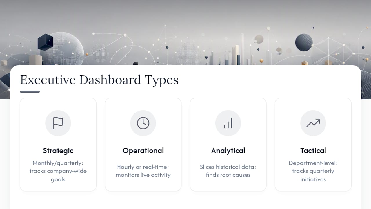
Four types show up in most organizations. Strategic dashboards track company-wide goals for board meetings, updated monthly or quarterly. Operational dashboards monitor live activity like support tickets or shipment status, refreshed hourly or in real time. Analytical dashboards let specialists slice historical data to find root causes. Tactical dashboards sit between strategy and operations, tracking department-level progress on quarterly initiatives.
For a weekly leadership review, use a tactical or strategic view. For a board pack, strategic only. For monitoring a live launch or an operations floor, that's an operational dashboard, and it doesn't belong on the CEO's home screen.
What KPIs Belong on an Executive Dashboard?
Six to twelve. That's the range, and it isn't arbitrary. Executive-dashboard best practices point to this number because past a dozen metrics, executives stop scanning and start hunting, which defeats the entire purpose of a one-screen view. Cognitive load rises, decision speed drops, and the dashboard becomes just another tab people ignore.
Choosing which metrics make the cut comes down to three tests. Does this metric tie directly to a decision someone will actually make this week? Does it have a target or benchmark attached, so a number without context never appears alone? Does it show trend and variance, not just a static snapshot? A metric that fails all three tests doesn't belong on the executive view, no matter how easy it is to pull.
Here are sample KPI sets by role, each sized for a real dashboard:
- CEO: revenue vs. target, gross margin, customer acquisition cost, net revenue retention, cash runway, employee headcount vs. plan, top strategic initiative status
- CFO: cash flow, burn rate, gross margin trend, accounts receivable aging, budget variance by department, forecast accuracy
- COO: on-time delivery rate, capacity utilization, defect or error rate, cycle time, vendor performance, headcount vs. plan
- CMO: customer acquisition cost, marketing-qualified leads, conversion rate by channel, customer lifetime value, campaign ROI, brand awareness trend
Present each one as a KPI card: metric name at the top, current value in large type, a small trend line or sparkline beneath it, and a comparison to target off to the side. A revenue card might read "$4.2M this month, trending up, 94% of $4.5M target." That single card answers three questions at once: where are we, which direction are we moving, and are we on pace.
What Design Principles Make a Dashboard Actually Usable?
Simplicity wins over completeness every time. Visual hierarchy should follow an inverted pyramid: the single most important number sits top-left, because that's where a reader's eye lands first, and everything else supports it in descending order of urgency. This isn't decoration. Dashboard design principles from UXPin treat hierarchy as the difference between a dashboard someone reads in ten seconds and one they abandon.

Color should mean something, not just look nice. Use green, amber, and red strictly for status, and keep everything else in a neutral palette. The moment you use red for something that isn't a warning, you've trained your executives to distrust the color coding entirely, and TechTarget's dashboard design guidance is blunt about how quickly decorative color erodes usability. Every number also needs context. A figure with no target, no prior period, and no trend line is just a number floating in space.
Progressive disclosure keeps the summary clean: show the headline, hide the detail behind a drill-down or filter. Adding more charts to answer more questions is how a dashboard slowly turns into a report nobody opens. Keep typography, spacing, and interaction patterns consistent across every view so executives never have to relearn how to read a screen they've seen a dozen times before.
Pro Tip: If you're debating whether to add a tenth chart to answer a rare question, don't. Build a drill-down link instead. The summary view should only ever grow by subtraction.
Which Charts and Layouts Work Best for Executives?
Layout follows a simple pattern: headline KPI row up top, trend visuals in the middle, and a detail table or drill-down link at the bottom for anyone who wants to dig further. That structure alone solves most of the clutter problem before you even pick a chart type.
Match the visualization to the question, not the other way around:
- Big, bold numbers for single point-in-time metrics like current revenue
- Line charts for trends over time, like monthly churn
- Bar charts for comparisons across categories, like regional sales
- Bullet charts for progress against a target in one compact shape
- Sparklines inside KPI cards to show direction without eating space
- Skip pie and donut charts. They're hard to read at a glance and rarely earn their space on an executive view.
For board presentations or tablets, increase font sizes and stack KPI cards vertically rather than shrinking them to fit. Tableau's best-practices documentation recommends designing at the actual display size, iPad landscape for board members, a laptop screen for weekly reviews, rather than hoping one layout resizes cleanly everywhere. Status indicators and the "last updated" timestamp belong in a consistent spot, usually top-right, so nobody has to search for them.
How Do You Design and Roll Out an Executive Dashboard?
A repeatable process beats a one-off build every time. Six steps get you from blank page to a dashboard leadership trusts:
- Define the decisions the dashboard needs to support, not the metrics you already track.
- Select KPIs using the decision, owner, and target test from the section above.
- Prototype a rough version, even a spreadsheet mockup, before building anything in a BI tool.
- Validate with executives by walking them through the prototype and cutting anything they don't reference.
- Implement the data layer, wiring up real sources and confirming metric definitions match across systems.
- Launch and iterate, treating the first version as a starting point, not a finished product.
A simple prototype, even a mockup, validated with the actual leadership team before full development reduces rework significantly compared to building the polished version first and hoping it lands.
A quick prototype can be ready in days. A production dashboard wired to real data sources usually takes several weeks, longer if you're pulling from many disconnected systems or building custom visualizations. An executive sponsor owns the decisions and KPI list. A BI or analytics owner manages data logic. A data engineer handles the pipelines. A designer owns layout and hierarchy. Review the dashboard monthly at minimum, and treat any request to "just add one more metric" with real skepticism.
What Are Good Executive Dashboard Examples and Templates?
A board-facing template usually opens with 8 KPI cards across the top: revenue, margin, cash, and a handful of strategic milestones, followed by a single trend chart section. An operations-leadership template swaps in throughput, defect rate, and capacity utilization. A growth-team version leans on acquisition cost, conversion, and retention.
Public dashboard examples, like the San Mateo County health data dashboard, show the same principles at work outside the corporate world: consistent layout, timely data, and a design that favors clarity over completeness. Open metric libraries such as MetricHQ are useful starting points for standard KPI definitions if you're building your first template from scratch.
Choose your tooling based on scale. A spreadsheet works for a five-person leadership team checking numbers weekly. A lightweight dashboard tool fits mid-size teams needing shared, always-on views. Full BI platforms like Qlik make sense once you're managing dozens of data sources and need governed, enterprise-wide semantics. Geckoboard suits teams that want a fast, visual dashboard without heavy IT involvement. ClearPoint Strategy is built specifically for strategic and board-level reporting, tying KPIs directly to strategic initiatives rather than raw operational feeds. Whatever template you borrow, change the KPI definitions and targets to match your own business before you trust a single number on it.
How Do You Keep Dashboard Data Trustworthy?
Every dashboard needs a single source of truth. Two systems reporting different revenue numbers destroys trust in the whole dashboard within a week.
Before launch, run these checks and keep running them:
- Confirm every metric traces back to one authoritative data source
- Document metric definitions in a shared, accessible catalog
- Test the dashboard against last month's known numbers before going live
- Set up alerts for any metric that moves outside its expected range
- Assign one named owner per metric who gets pinged when something looks wrong
- Apply role-based access so sensitive financial or personnel data is visible only to the people who need it
What Executives Get Wrong About Dashboard Design
The most common failure isn't a bad chart. It's too many KPIs, inconsistent metric definitions across departments, and dashboards that quietly turn into reports nobody opens after week two.
The fix is almost always subtraction, not addition. Before shipping any dashboard, hand it to your least data-literate executive and watch where they hesitate. That pause tells you more than any design review.
How Strategy Haus Helps You Build a Dashboard That Actually Gets Used
Most leadership teams don't need another chart. They need someone to sit with their strategy, decide which numbers actually matter, and build the system around it. That's the gap Thestrategyhaus fills: less "here's a template," more "here's your dashboard, wired to your data, with an owner assigned to every metric."

Thestrategyhaus works through the same execution-focused approach it applies to strategic planning and operations design: translate the strategy into specific KPIs, prototype the view with your leadership team, and hand off a rollout plan with clear ownership so the dashboard survives past launch. A typical engagement includes a working prototype, documented metric definitions, and a rollout plan your team can run without ongoing hand-holding. If your current dashboard is a spreadsheet nobody trusts or a BI tool nobody opens, start with a diagnostic conversation through Thestrategyhaus's consulting services and walk away with a concrete next step instead of another slide deck.
Frequently Asked Questions
How many KPIs should an executive dashboard have? Between 6 and 12. Fewer than that and you risk missing key signals; more than that and executives stop scanning the whole screen and start hunting for the one number they came for.
How often should an executive dashboard refresh? It depends on the decision cadence. Strategic dashboards for board meetings can update monthly. Tactical dashboards for weekly leadership reviews need weekly or daily refresh. Operational monitoring needs real-time or near real-time data.
What's the difference between an executive dashboard and a BI report? An executive dashboard is built for a five-second scan and a decision. A BI report is built for exploration and detail. If your dashboard needs scrolling or multiple tabs to read, it has drifted into report territory.
Should I use Qlik, ClearPoint Strategy, or Geckoboard for my dashboard? It depends on scale and purpose. Qlik suits enterprises with many data sources needing governed reporting. ClearPoint Strategy fits organizations tying KPIs directly to strategic initiatives for board reporting. Geckoboard works well for smaller teams wanting a fast, visual dashboard without heavy setup.
How long does it take to build an executive dashboard? A rough prototype can be ready within days. A production version wired to live data typically takes several weeks, depending on how many systems you're pulling from and how much custom visualization work is involved.
Sources
- 10 Dashboard Design Principles and Best Practices | TechTarget
- Dashboard design principles | UXPin
- Executive Dashboard Design Best Practices: 10 Rules 2026 | Appdeck
- Dashboards best practices | Tableau Help